 |
The very first piece of typography which I see every day is the text used on my digital watch. This is a very basic sans serif font around the face of the watch providing information such as a compass and the different functions of the watch. This typeface is very simple and therefore it serves its main purpose of being easily legible, allowing you to quickly read the compass or other information. The most important part of the watch (the time) is also presented in a very commonly used numerical typeface, which consists of using six basic lines in order to create any number combination. Once again, this is very effective due to its clear legibility allowing you to quickly read the time whenever you need.
|
 |
The second piece of typography of which I see every day is the text used on my toothpaste packaging. This is a sans serif font using both bold and non-bold text to create a very 'modern' and 'hygienic' feel. I believe that this text works very well in portraying the purpose of the product as it uses a 'clean cut' font with sharp edges, which successfully links the text to the idea of clean teeth. The green colour scheme links to the unique selling point of this product which is the Aloe Vera plant content used in this toothpaste (which is a green plant). The added purple features help to contrast against this making the text stand out.
|
 |
A further piece of typography which I regularly see in the morning is the text used on the top of the hot and cold taps in my bathroom. In order to fit in with the vintage/ art-deco theme throughout our house, the taps use a very traditional serif text (which looks very similar to 'Times New Roman'). Despite the fact that this is a slightly more decorative typeface, it still serves its purpose of informing the user the temperature of the taps, as well as fitting in with the traditional theme of the house.
|
 |
| An additional style of typography which I see most days is the 'Cath Kidston' tag on my wash bag. This font follows quite a traditional pattern which relates strongly to the old fashioned style of 'calligraphy' however with a modern twist due to its fluctuation in thickness (mainly seen in the capital letters). This type face fits in very nicely with the products that Cath Kidston creates, as she uses old fashioned prints or objects and adds a modern twist - which I believe is exactly what has been done with this particular font. |
 |
| Around my house are a lot of original enamel signs (mainly dating back to the 1920-1960's) of which my parents and I have collected over the years from various antique shops and auctions. This particular sign is estimated to have been used during the 1920's which can be seen from its traditional serif typeface. One of the main reasons I like signs and packaging from the 1920's - 1980's is that all of the typography and imagery is done by hand, meaning that it is much more unique and a lot of skill goes in to making signs like these. Despite the fact this typeface is of a bold, serif style, it uses very subtle 'flicks' on the end of the letters making it look almost 'modern' for a poster from the 1920's. I believe that this typeface fits in very well with the product as it uses traditional 'bath time' colours and is easily legible for both children and adults. |
 |
| Above is one of my favourite pieces of design from my mum's portfolio when she was working for the bath and body retailers 'Crabtree and Evelyn'. This cup design was part of a huge collection of traditional designs and packaging - in which all of the original fonts and typefaces were hand painted. This particular hand painted typeface is incredibly decorative and despite the fact it is legible, it would not be readable if used to write paragraphs of text. The serif typeface fits in beautifully with the products as they use traditional ingredients such as rose water in order to create bath products. Also this decorative typeface follows a colour scheme of blue and white, which is a colour often used in traditional crockery. As I previously mentioned, I love the way this typeface was painted by hand as it gives it an original and personal twist. |
 |
| Above are two more traditional posters which date back to the late 1940's. Just like the 'Crabtree and Evelyn' typeface, the typefaces used in both of these posters are also hand illustrated and painted, once again adding an original and personal touch. The majority of text used in both posters is of a sans serif style, which shows that these posters are mainly aimed at children/the genral public as the typefaces are much less formal. The 'childish'/'fun style of typeface also links in with the fun block colours used in the colour scheme and relevant imagery. The mixture of bold and normal text really helps to add impact to the poster and draw attetion to the bold lettering in a very effective way. |
 |
| Above is a milk jug in my kitchen which is a very old Emma Bridgewater piece. Emma Bridgewater is a famous English potter and all of her work is hand painted, making all of the fonts really beautiful and unique in my opinion. This particular serif typeface has a very nice finish around the edges of the letters due to the watercolours used against the pot material. I personally really like the Emma Bridgewater range of pottery, mainly down to the handmade feel. |
 |
| One of the pieces of packaging which most people will encounter every morning is the label on a carton or bottle of milk. The semi-skimmed milk which I have is one of the basic supermarket brands, 'Sainsburys'. The quality of milk is usually exactly the same as any other up market brand, however the supermarkets are able to offer a cheaper rate as they save money on packaging. As a result this value packaging uses basic sans serif typefaces and minimal colour, however it still manages to portray all of the relevant information. |
 |
| This is a pair of cushions in my lounge which we recently bought. The 'Keep Calm and Carry On' range of merchandise has recently become very popular in Britain due to a number of reasons such as the diamond jubilee, Wills and Kate's royal wedding and also the London 2012 Olympics (all of which promote Britain an British History). The 'Keep Calm and Carry On' poster was originally created as a 'moral boosting' poster during the war, and they were going to be released during a nuclear war (thankfully they never had to be used!). The typeface used on this cushion is a bold, white, sans serif font used in both a large and very small size. This really stands out against the deep red background and also links in with the adorable illustration of a crown above the text. |
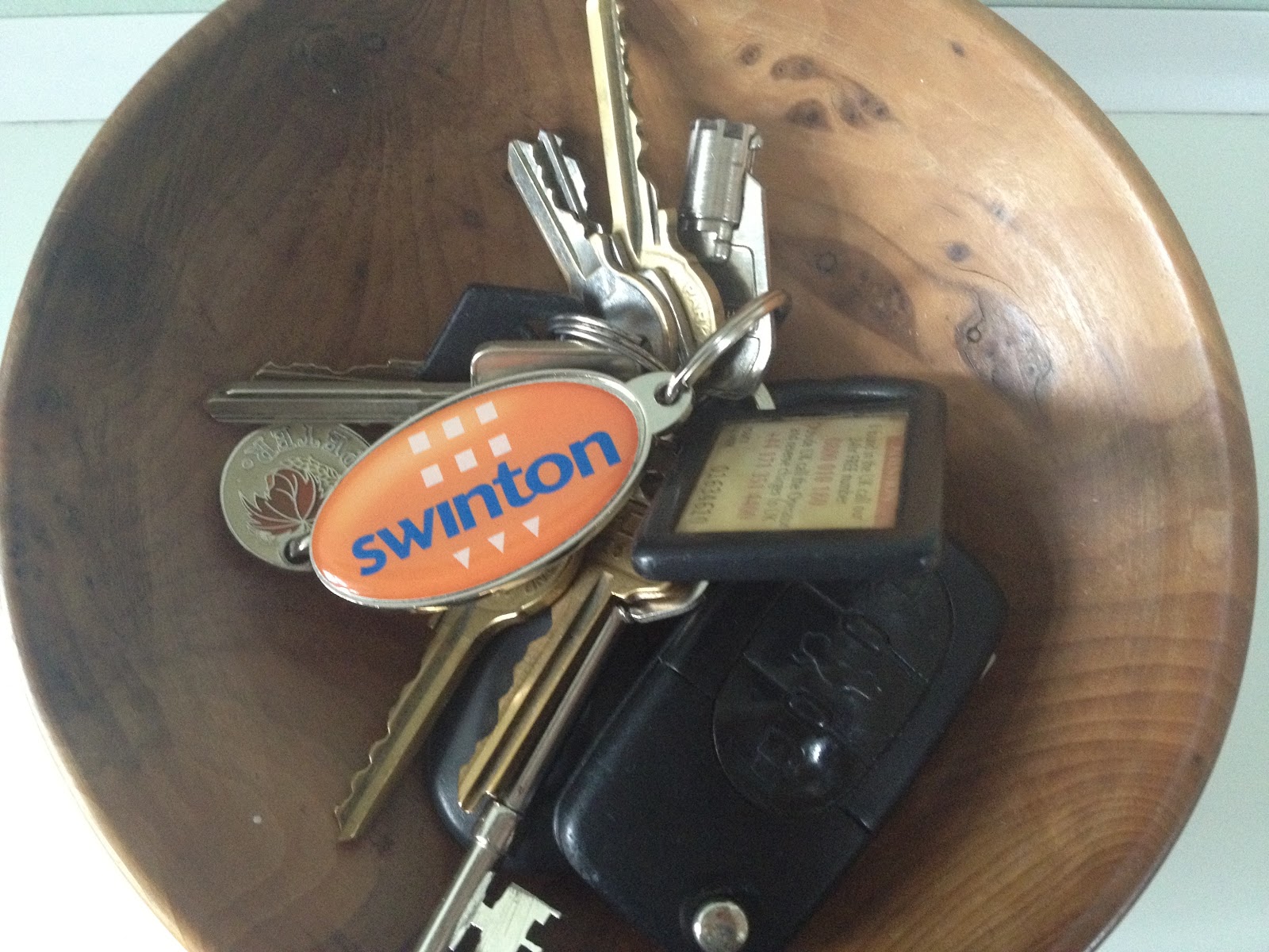 |
| The 'Swinton Isurance' logo on this keyring uses a sans serif typeface, however it has little adjustments such as the letter 'T' joining up with the 'O' ad also the slightly modified peak on the letter 'W'. This is quite a formal and serious typeface which suits the company very well. However I really dislike the actual logo as i believe it uses irrelevant imagery and colours which have no relation to the company itself. |
 |
| This signage for a small graphic designers mainly uses a very basic sans serif font however instead of spaces between the words they use full stops to give a stylish take on basic punctuation. The logo for the company uses many geometric shapes in order to create a futuristic, digital typeface. I really dislike this typeface for two reasons. Firstly, the typeface used in the logo suggests that this small business produces cliché work, mainly because this sort of digital, 'modern' typeface is the first thing that people think of when graphic design is mentioned in this day and age. Secondly, personally I really tend to dislike packaging, corporate identity's or any other kind of graphics when they are solely done using computer software as it mainly lacks quality promotes laziness. Altogether I believe the typefaces used in the sign do relate vaguely to the company, however it does not draw attention to the poster itself. |
 |
| This sign for a computer consultants uses a combination of bot serif and sans serif typefaces. I believe that this is to communicate the fact that this company are up to date and very modern in the technology and people that they use (relating to the sans serif strap line) however they also use traditional values and customer service (relating to the serif text). |
 |
| This is the typeface used for the Trafford council logo which, similarly to the Cap-Gemini logo, uses both sans serif and serif text to create a logo which relates to the history of Trafford with its traditional typeface, however suggests that Trafford is a modern area with the addition of sans serif text. |
 |
| This is also an advertisement from the small graphic design company which I discussed previously. The text used in this advertisement is identical to that of the typeface used in the signage for the company. I believe that they use the exact same typeface for all of their own advertisements as it helps to link together all of their different pieces of corporate identity, making the company look more professional. |
 |
| Above is a pedestrian road sign which uses very basic, legible and readable text. This bold, capital, sans serif font means that almost everyone is able to read this lettering in order to safely cross the road. |
 |
| This is an example of some sinage which serves the purpose of providing time information for people shopping at the supermarket Sainsbury's. Similarly to the pedestrian sinage, this uses quite a basic font so that it is readable from far away. However, this typography looks very unprofessional due to the fact the letters and numbers are not in any sort of alignment, and there is also a mixture of bold and un-bold lettering (for example the number '0' on 8:00am is much bolder than the '0' next to it. This lack of quality does not set a very good first impression for the store, and it also makes customers think that this store is unprofessional and organised. |
 |
| The lettering seen on road signs also had to be easily readable and legible from a distance (as people may be in cars or far away from the signs when they need to read them). The vast majority of road signs use a bold, capital letter typeface with sufficient tracking between each letter. However this sign is not well kept and the whole point of the road sign has been defeated die to vandalism. |
 |
| Above is a special 'seasonal edition' of the shower gel Original Sauce. This is a brand which I know lots about as I helped my dad to generate ideas and pick a final design for this company as he had been commissioned to re-design the packaging for this line of products. We chose this final design as it is very different from any other sort of bathroom product, due to the fact it used bold eye catching fonts and colours, which also relates to the intense smell. Once again the unusual shape of the bottle was chosen because it would draw attention to itself and also would be memorable/iconic. The typeface was one of the most difficult things to choose for this brand as the text needed to be legible however needed to also fit in with the bold and quirky theme. The bold, stretched text fits in with the shape of the bottle but also has enough modifications to look unusual yet readable. |
 |
| Above are two items of shampoo and conditioner from the same range, which can be seen from the way in which they fit together like a 'set'. The main text used on both the shampoo and conditioner is a stylish, italic typeface which stands out against the white or light blue background (creating a very clean image, fitting with the unique selling point of the anti-dandruff range). |
 |
| Above is one of my examples of two very similar food products, however one of them is an upmarket, recognized brand, where as the other is a 'supermarket own brand. Firstly, the typeface for the upmarket 'Super Noodles' is a very large, capital letter which is curved around the relevant imagery for the product. Each letter had a light blue edge which is separated from the rest of the letter using foil blocking. This gives the impression that the product is special and much more elite as the company can afford a shiny, foil block finish. The 'Super Noodle' product also uses over thirteen different colours which also suggest that the company has a high quality product as they have money to spend on things like excess colours. Compared to this, the main typeface used on the Supermarket own brand is a very basic lower-case, handwriting text, which looks almost as if it has been hand drawn. The packaging for the own brand noodles only consists of about five different colours and had no fancy printing processes such as foil blocking. This suggests that the contents are very basic and that not a lot of money has been spent on the packaging. However I believe that despite the fact people may be astetically drawn to the up market brand, the supermarket brand has the unique selling point that it only costs 13 pence where as the up market brand costs 68p. |
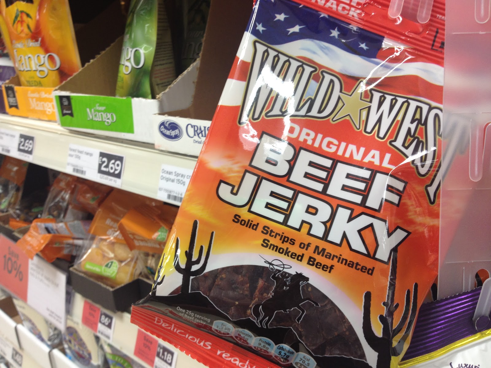 |
| This packaging for one of my favourite snacks, Beef Jerky, uses two main typefaces. The first typeface can be seen in the company logo 'Wild West', which is a very iconic 'old western' style of writing. This relates strongly to the origin of the food and the flavour. The second main typeface is the very large, bold, white lettering in the centre of the packaging which reads 'Beef Jerky'. This lettering is mainly used to simply draw attention to the packet (because of its size) and also to provide the basic information about what the packet contains. This works very effectively. |
 |
| The two main pieces of typography on this packet of chocolates is the text used in the 'Galaxy' logo in the top left corner, and also the name of the product, 'Minstrels', in the centre of the product. The text used in the logo is hand illustrated (most probably on the computer) and is very clever in the way that it replicates liquid chocolate being drizzled into the shapes of the letters, which relates to the companies products and also looks very attractive. The typeface used for the product name is quite similar to that of the brand, as it is replicating the chocolates inside making the letters a long, thin, almost oval shape. It also uses an illustration of one of the chocolates to incorporate it into the actual word, which is very clever as it links the lettering with the relevant imagery. |
 |
| Above is an image of the well known brand of spreadable yeast 'Marmite'. However this particular jar is a special edition jar for the queens diamond jubilee. The typefaces used on this jar fit in very well with the patriotic theme die to the fact I have previously seen this sort of text used on propaganda posters used during the war. There is also a play on words on this particular special edition jar at the word 'Marmite' has been turned into 'Ma'amite' referring to the queen as Ma'am. Altogether the text on this jar works very well with the theme. |
 |
| Above are two different types of Bulmers Cider (Original and Pear). Both of the ciders use very similar layouts and identical typefaces, with slight differences to the colour and name. This typeface (used for the main 'Bulmers' heading) is very traditionally English and has a slight drop shadow adding new dimensions to the packaging. The fact that the company has used the same text for both varieties of the cider is very clever as it links both types together, which looks much more professional and aesthetically pleasing. |
 |
| Shloer is another brand of drink which uses the same layout and typefaces when creating different flavour variations of the same product. the main typeface on this packaging is very unusual as it has a very strange, unorderly alignment of the letters. This odd arrangement of the letters helps to create the illusion that the letters are acting like bubbles in the sparkling drink. Or it can also be seen as trying to replicate a disorientating take on the letters, suggesting that the words are drunk. |
 |
| The 'Old Jamaica' text on this bottle of ginger beer works very well with the brand as it uses a very old fashioned 'Old English' style of writing to relate to the origins of the beer. |
 |
| This is another comparison of an up market brand and a supermarket brand. The supermarket brand of a carbonated cherry flavoured drink uses very basic sans serif text which is a generic typeface selected from a computer. In comparison to this the up market 'Tango' drink (of the same flavour) uses a typeface which has been modified specifically for this product. The typefaces used on the branded drink use much bolder colours and creative angles to attract the intended target audience, where as the supermarket own brand has quite a simple layout in comparison. Once again the unique selling point of the supermarket brand is that it is a fraction of the price as money isn't spent on fancy packaging and marketing/advertising. |
 |
| The typeface used for this orange flavoured cake is very clever and original as it uses the texture of orange peel to create 'orange-like' lettering. This really helps to give the customer an idea of the flavour of the cake without having to read the box in detail. The orange of the text also contrasts with the navy blue of the box, making it more aesthetically pleasing. |
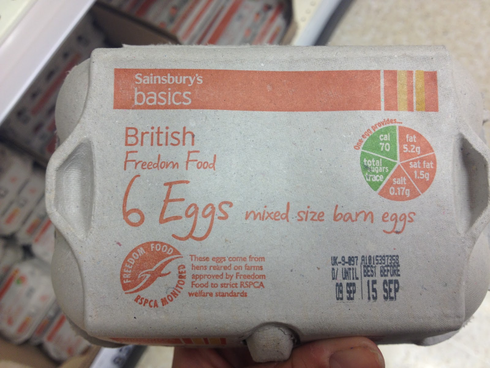 |
| Above is an image of some supermarket own eggs, which similarly to the other supermarket own products I have discussed, uses a very basic 'hand written' style of font. The only unusual thing about the text on this egg box is that it is printed on a very low quality card board, meaning that the text is dull and a little less legible that if it were on a white background. This may be to cut cost of material or to keep the eggs fresh. |
 |
| Above is sinage for a vehicle breakdown service 'RAC'. The main reason I took this photo is because I could not believe how unprofessional this information looks, obviously due to the fact it has been hand written in a very poor way and has also been a victim to the British weather. |
 |
| Above is the main typeface used for 'Biffa' (a waste disposal company) which is a very bold, sans serif typeface. The only distinctive feature of this font is that it has slightly curved edges. It does not relate very well to the company and what the company does, but then again, would they really want to advertise waste? |
 |
| Above is a very stereotypical type face used for pup signs and notices all over the UK. This typeface is mainly done by hand using chalk or paint. I really like this particular style as it is unique to the pub and the drop shadow makes it look slightly professional. |
 |
| This beautiful old packaging for a Swiss chocolate bar uses a very old fashioned layout and typeface, combining sans serif text with beautifully hand written text over the top. |
 |
| The lettering on this 'Barbie' cake mix is aimed at young children and therefore easily readable and legible. It uses sans serif fonts which are generally much easier to read than serif fonts, and also uses bright, bold colours to stand out against the pink pattern of the background. |
 |
| This lettering for a piercing parlour uses a very old fashioned, traditional typeface called 'Circus'. This suggests that the shop is vintage and old fashioned, which is becoming increasingly popular in fashion and art. |
 |
| This photograph is of an advertisement for a shop in the northern quarter of Manchester (to the left of the photograph). This advertisement uses a multitude of different fonts and typefaces such as serif, sans serif, bold, italic, 'graffiti', contemporary and old fashioned styles. This links in very nicely with the shop as it is a collectors shop which stocks a multitude of different collectors items. |
 |
| I found this advertisement in Hmv (the popular game shop) which is advertising their great deals through out the summer. The main typeface which they have used to spell the word 'Ace' is incredibly clever as they have used an image which you would relate to summer (Ice lollys/Ice cream) and made it so the letters look like they are made of this food. This was achieved on a computer design programme and the extra details, such as the frost on the edge of the letter 'E', really helps to add to the effect. |
 |
| This advertisement was also in the game shop 'Hmv' and uses a type face which is related strongly to vandalism and graffiti due to its 'paint spillages' and also the way in which it looks like it has been done with a stencil. This fits in nicely with the relevant imagery of the artist next to the text, and it also appeals strongly to the target audience. |
 |
| Above is a 'Super Mario Bros 2' poster which I saw in the gaming shop Game. This point of sale uses bold, sans serif text with a deep drop shadow to create a three dimensional effect. The white of the letters really contrasts against the black of the drop shadow to draw the customer to the writing. |
No comments:
Post a Comment